Tag Archives: mac

Genealogy Apps in the Mac App Store (Update)

Over two years ago I wrote about the launch of the Mac App Store, Apple’s resident app store available on all modern Macs, and the three genealogy-related applications that launched with it. At the time the three applications available were MacFamilyTree, Family Tree Maker, and Date Calculator.

Two years later, what is the state of Mac genealogy in the App Store? There are now six applications that show up if you search ‘genealogy’:

Six Genealogy Apps in the Mac App Store

MacFamilyTree and Date Calculator are still there, while Family Tree Maker has been dropped from App Store. Newly added applications include Heredis, My Family Tree, GedScape Gold, and MemoryMiner.

Why did Ancestry.com drop Family Tree Maker from the App Store? I have no idea, but there are a few possibilities. The coding standards for applications in the Mac App Store are very strict, and they’ve gotten stricter over time. It’s possible one of the those restrictions made it difficult for Ancestry.com to comply with the rules of the store. It’s also possible that the lack of a clear upgrade path in the App Store was a bigger issue. Ancestry.com sells annual upgrades to their genealogy applications, and the App Store doesn’t make this very easy. If anyone purchased Family Tree Maker on the App Store, I’m curious if you received any notification that the app was pulled, and for what reason.

Heredis had a major update recently, and that included launching it into the Mac App Store, as well as a free version for iPhone and iPad. Heredis calls this version the ‘Blue Suite’ and includes interperable version on PC, Mac, and iOS. I haven’t used this new version of Heredis, but it looks quite impressive. There’s actually a 20% off sale going on now for Heredis, through February 24, through the app store or through their web site. They have a free trial version also, so it’s worth checking out first. Two of the more interesting features to me include the ability to create illustrated charts (i.e. a tree superimposed on an actual tree graphic) and the ability to generate a book. I’ve published a genealogy book before, but it required a lot of work in Adobe InDesign, and took months to finish. Imagine being able to generate a book with a single click? I haven’t used this feature, but it’s something I think all genealogy application should offer in some form.

My Family Tree and GedScape Gold are two apps I’ve never heard of before. My Family Tree seems to be a chart-based genealogy app that keeps an updated chart that you can add people to, but they show no other features in their description, and no trial version on their web site. According to reviews in the App Store, there are some bugs and support is not easy to get. It looks like an early version of an app that could offer a simple genealogy option to some, but it isn’t quite ready yet (or supported well enough). GedScape Gold is a program to browse GEDCOM file and output a web version of your family tree. The application seems to have mixed reviews, although unlike My Family Tree, there is a support site and a free trial version available to test before buying. I suppose there is a purpose for GEDCOM viewers, but I certainly lean towards more full-featured applications.

MemoryMiner is an application I really like, and am happy to see it’s in the App Store. This application fits in my visual sensibilities, where you can take a large number of photographs and link each person in the photo and can switch between looking at photos fro ma specific place, or of a specific person, etc. It’s very powerful, and also includes the ability to import a GEDCOM file to populate the person database. My only big problem with the app is that while you can import a GEDCOM, it’s very difficult to subsequently update information on the people you import. If you’re working on a project over a long period of time, chances are your family database will be updated, and it would be great if you could import those changes easily. Another problem is the web site of the company hasn’t been updated since 2011. Hopefully this is still an actively developed application, as it is unique in the way it allows you to tell a visual story of your family.

One last note. In my post last year, I mentioned that Date Calculator was created by the same company that puts out GEDitCOM II, a very interesting genealogy program for the Mac. GEDitCOM II has some very advanced features I’ve never seen in any genealogy program on any platform, including scripting using Applescript, Python and Ruby (including an online library of downloadable scripts), allows you to completely customize the user interface (including downloadable UIs), outputting a book using LaTeX (see this PDF of a book output of the Windsor family), etc. It’s really quite an impressive program, but even though its been updated to work with application signing for OS X (a feature needed to show that a program is from a reliable source), it is not yet available through the App Store. I’m sure there are some good technical reasons for it not being available through the App Store, but it’s really a shame as I think GEDitCOM II is underrated and could use the extra publicity of being available through the App Store to gain marketshare.

Another look at GRAMPS

Back in January I took a look at the free genealogy program GRAMPS. GRAMPS started on Linux, but is now available for Windows and Mac. I was looking at it specifically for use on the Mac, as that’s the platform I use. At the time, at version 3.2.5, it was not yet stable enough on the Mac to use. Indeed there was at least one major issue which I submitted as a bug to the developers, but I haven’t had time since then to fully test it again. Recently version 3.3.0 was released, and I decided to give it a spin once again. As I mentioned back in January, I really like the idea of a free open-source cross-platform genealogy program, and I’m rooting for GRAMPS to be competitive with other genealogy programs out on the market.

This time, things went a lot smoother than my first attempt. For one, everything installed easily and I didn’t see any error messages when loading the program. Oddly the program loaded on my second monitor, which is very unusual. It’s possible I had moved the application to my second monitor back in January and this version accessed some preference file from the old version, but in any case I’ve never seen an app boot directly to my second monitor.

Exporting and Correcting a GEDCOM from Reunion

The first thing I did was export a GEDCOM file from Reunion to load into GRAMPS. Knowing from previous attempts that GRAMPS would not recognize the relative paths used int the image file locations, I opened the GEDCOM first in a text editor and did a find-and-replace on the relative path:

GEDCOM excerpt showing relative path to an image file

In the above image (click to enlarge) you can see the relative path on the line that starts with FILE starts with ~/ which is supposed to point to my home directory. This is a UNIX shortcut, which makes it is surprising that GRAMPS doesn’t know how to deal with it. In any event, on the Mac your home directory is located at /Users/USERNAME/ or in my case /Users/philip/ and as you can see in the Find box, I replace all instances of ~/ with /Users/philip/.

GEDCOM excerpt showing absolute path to an image file (after Replace All)

In the above image you can see that 935 instances of ~/ were replaced, including in the image location shown in the GEDCOM.

One other thing to notice in the GEDCOM is that Reunion output not only the image location, but a line called _CROP which gives coordinates of how the image was cropped within Reunion. Reunion lets you re-use images with different people (or even multiple times with the same person) and for each instance of the image you can crop it how you’d like. For example, if you have a family photo that shows two parents and four children, you can assign that photo to all six people, and crop the photo for each person so when displayed will only show the head of the person you want. This is a very nice feature, but GEDCOM doesn’t have a standard way to deal with it. I don’t even know if GRAMPS can handle per-instance cropping of photos, but in any case it certainly doesn’t know how to import Reunion’s cropping information. Hopefully the efforts to improve/replace GEDCOM will in the future include a standard way to share that kind of information, and hopefully GRAMPS will add this feature as well.

Importing the GEDCOM into GRAMPS

Once I made the replacements in the file I wanted to load it into GRAMPS. For those used to standard Mac user-interface norms, GRAMPS doesn’t try to match them. This has been a complaint by other users of GRAMPS, that they should try to adapt to the user-interface ‘widgets’ of the operating systems they are targeting. Beyond the look of an app, there are also usage norms of which Linux users, Mac users and Windows users all expect something different. That said, I’m not sure if some of the user-interface issues are due to the fact that the program originated on Linux, or are just the user-interface decisions of the developers. When getting started, GRAMPS makes you create a new family tree, then load the new tree (which oddly takes more than a few seconds) and then lets you import a GEDCOM. The GEDCOM import was quite fast, and in my case importing 1800 records took only few moments. Why couldn’t I just import a GEDCOM into a new family tree? No idea.

GRAMPS Views

GRAMPS offers several very interesting views of your data – People, Relationships, Families, and Ancestry. GRAMPS also lets you look at your Events, Places, Geography, Sources, Media and Notes. These views are great, as they let you look at your data in some very useful ways very quickly. One thing that is very interesting, for example, is to be able to see all the Places that are present in your family tree. As Reunion does not standardize place names, in my case the list of Places shows some of the many duplicate and inconsistent names I’ve used in my tree. It also lets you easily correct the names and then merge duplicate names so that they link to a single reference. Thus, if you choose to change the name of the town later, the change will show up in all records that reference that location.

I also tried the Geography view which starts out as a map of the world, but somehow I zoomed out so far that I couldn’t see anything and I couldn’t get it to go back to a normal view of the Map. In fact, the coordinates shown for my location on the map was:

Geography view coordinates

Now I wasn’t a geography major, but I’m pretty sure it’s not possible to go to W 16534˚ on a map. Now the way I zoomed was using the multi-touch trackpad on my MacBook Pro, which the developers who use Linux might not be familiar with, so perhaps this bug isn’t possible to reproduce on Linux, but it definitely exists on the Mac. A map reset button might be good here.

In any event, I like that with each view there is a Filter panel that lets you search within the view and reduce the number of records shown to match what you’re searching. Reunion lets you search lots of fields, probably more than GRAMPS, but it does so from a single search window, and you either search one field or all fields at once. GRAMPS’ filtering seems more useful for quick searches within the view you’re currently in.

I have to say, having used Reunion for more than ten years, the views in GRAMPS seem a bit strange to me. Obviously one can argue over what views are best in genealogy program, and having many options (Reunion is really just one view) is a good thing, but I find the views somewhat redundant and inconsistent. For example, The Relationships view is a view that shows all the direct relationships of a person, such as parents, spouse(s), children and siblings. The siblings are a nice touch since most genealogy programs only show parents  and children of a person in a single view. That said, I generally need to scroll down to see all the information in this view, which limits its usefulness for quick navigation through family members. In Reunion, which is based on a Family view (a Couple is the center of the view, which shows basic information on each of the couple’s parents above them, and of all of their children below them), if I want to see someone’s siblings I click on the parents of the person, and the parents become the couple at the center of view, and the children at the bottom include the person I was originally looking at and all of his/her siblings. That isn’t necessarily the most natural way to see this information, but it works in a very consistent manner. Thus it is easy for me to navigate up and down through the tree using just this single Family view.

In GRAMPS, the closest thing to the view in Reunion is the Families view, except that its usage is user-interface-challenged. For example, if I go to the Families view I see a list of families, which is essentially a list of couples and their marriage dates if known. If I click on a couple I get a view that is similar to Reunion’s view that pops up in a new window (except it only shows parents and children, not the parents of the couple). In this new window, if I click on the one of the parents’ names, for example, nothing happens. There is a little document icon next to the names, however, and if I click on that icon I get a third window which lets me edit the person’s details (this is actually the same as Reunion except Reunion doesn’t use an icon but lets you just click on the name). Indeed this is the People view in GRAMPS, so you are seeing more than one view at a time). If I click on the childrens’ names, I get a different window which just seems to allow me to define the relationship of the child to the parent (birth, adopted, etc.). This seems like a waste of a window. If I was going to have a window like this, I would at least allow you to switch who the parents are of the child (such as when there are multiple marriages and you find that a child was born from a different set of parents than you thought). This raises a few other UI decisions I don’t understand in GRAMPS. In the view showing the parents and children, there is a minus sign that lets you remove one of the parents as a parent – but of which child? What if the father is the father of one child but not the other? In addition, there seems no logical way to add additional spouses in this view. Second marriages are common enough that this should be integrated into the view.

No Easy Navigation

The worst part of the UI seems to be that there is no way to easily navigate to other families through the view itself. Instead, I need to close the window, go back to the list of families and find the right family. That’s a bit absurd actually, especially if you have lots of people with similar names in your tree, or if you simply don’t remember the names of the parents. Reunion is a bit limited in its single view, but it is actually very easy to navigate within that view to find almost all the information you need quickly.

You might have noticed that earlier I said above that the user-interface in GRAMPS is inconsistent. Let me give an example. In the above mentioned view you can’t easy switch to the parents or children. In the Ancestry view, which is a kind of navigatable graphic tree, you can click on a parent of the person at the ‘bottom’ of the tree (it’s actually on the left side) to make them the bottom of the tree, but if the tree doesn’t show the children of the bottom person. There is a pop-up menu you can click on and then choose a child in order to make them the bottom person. This seems a weak UI choice. Why not show all the children of the primary person in the tree, to allow quick navigation of the entire tree. My main problem with GRAMPS is navigation-oriented, and when I see different (inconsistent) choices made in different views, and no easy way to navigate in a single window to information on different families, it is a big problem for me.

In the End…

After writing the above I decided to check out the different graphical views and reporting options, but ran into a roadblock. When trying to switch to a different Ancestry view (Timeline Pedigree) an error message was generated, and I was unable to continue. Indeed, this issue has prevented me from adding many of the screenshots I intended to add to the above to illustrate various features. I was prompted to submit a bug report which I did, but when I tried to re-launch GRAMPS and re-load my family tree I kep getting an error message saying the database was corrupt and to run a tool to fix it, but the program would crash before I could access the tool to fix the database. I suppose I could delete the tree and start over, but for the time being I’m going to wait. While this version (3.3.0) is much more stable than the previous version I tested, it clearly is not ready yet for everyday use, at least not on a Mac. I look forward to testing it in the future when these issues have been worked out.

New iPhone and iPad App from Ancestry.com

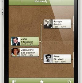
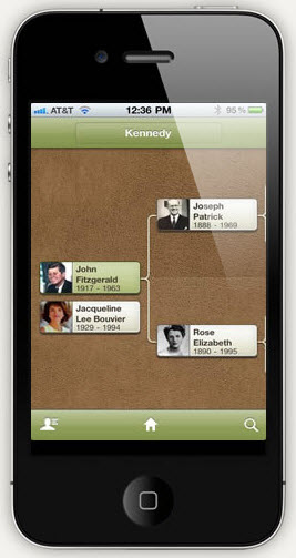
If you use Ancestry.com and you have an iPhone or iPod Touch, you might know about their Tree-to-Go app that came out awhile back. It was a very basic application for viewing the family trees that you had on Ancestry.com. Frankly, it wasn’t particularly useful, as it only let you view the trees you had uploaded to Ancestry.com and wasn’t very interactive. In addition, if you had an iPad with its larger screen, it was not optimized for that, and could not show anything more on the iPad than on the iPhone.

That all changed yesterday with the introduction of a new app, now called simply Ancestry.

This new version seems much more polished, and adds some major features.

First off, it fully supports the iPad, and can take advantage of the larger screen. You can now see not only the trees you have on Ancestry.com, but those that are shared with you from other users.


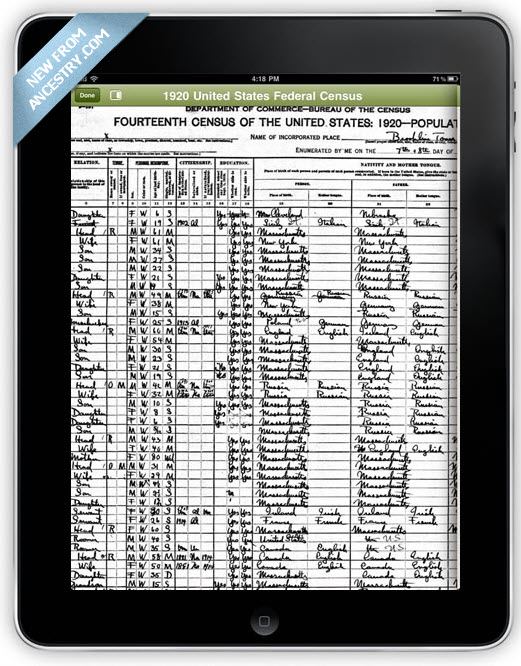
Also, if you’ve attached records to people in your tree, such as a census record, you can now view those records on your device (see the picture on the right).

For those who use both Ancestry.com and an iOS device (iPhone, iPod Touch or iPad) this seems like a very useful application, especially if you share trees with other Ancestry.com users. They also announced that they are ‘carefully considering’ the creation of an Android version as well, although I wouldn’t hold your breath waiting for an Android version.

The interesting thing to me about this seemingly very polished application is the contrast this illustrates with the Mac application they also recently introduced. Why is their iOS app so much more polished than their Mac app? It might seem odd that the iOS app, which is free, has had more attention in its design than their Mac application for which they charge quite a lot. I suspect the answer to this question is that the development of their iOS app is done by a completely different team than the one that handles Family Tree Maker. I’m not sure either of these applications are developed in-house by Ancestry, but either way it seems the teams working on these are completely different.

New versions of MacFamilyTree and FamilyTreeMaker for Mac

In the past couple of days both MacFamilyTree and FamilyTreeMaker for Mac have received updates.

MacFamilyTree was updated to version 6.0.11 which offers some minor web-output related fixes and some localization updates. You can download the update from their website, and for those who bought it via the App Store presumably it will show up there soon.

FamilyTreeMaker for Mac was updated to version 19.2.1.241 (yeah I don’t understand their numbering system either) and fixes ‘numerous stability issues’ and adds support for the GEDCOM 5.5.1 draft among other fixes. I’m surprised about the GEDCOM update, by which I mean I’m surprised FTM for Mac didn’t already support the 5.5.1 draft which was released in 1999 and has some very important updates like support for Unicode. If you have the retail version, this update should pop up when you launch the program or select ‘Check for Updates…’ from the menu. If you have the version from the App Store, again this will probably show up soon.

I own both of these programs, but do not use them very much because of two factors:

1) It’s hard to switch from one genealogy program to another, no matter how well they support GEDCOM.
2) As outdated as the Reunion is, and how much I complain about it, I still like the general user interface of Reunion and how it displays families in the program.

I’ve written previously about trying to switch to FTM for Mac, but I was unsuccessful mainly because of the difficulty of importing all the media files, and my general confusion over the user interface which I find very cluttered. In addition, I find the Internet features, while appealing, to be very slow.

I haven’t given MacFamilyTree its due I suppose, and many people like, but as I received it as part of a software bundle and didn’t actually buy it directly, I guess it hasn’t gotten enough mindshare from me. One day I’ll have to put it through its paces.

GRAMPS 3.2.5 released for Mac, but not ready for primetime

I really like the idea of an open-source genealogy program. The only real open-source genealogy program that runs on the desktop seems to be GRAMPS. GRAMPS stands for Genealogical Research and Analysis Management Program System. Yeah, I’ll stick with GRAMPS. Originally developed for Linux, it now has versions that run on Windows and on the Mac. I’ve tried it in the past but never really gotten it to work. When I saw a new version released today I installed it and tried again.

Unfortunately, I ran into error messages right from the beginning. I suspect this has to do with running the program on a Mac, a platform they claim to support, but which is not supported very well. After I got past the initial error messages (which prompted me to submit a bug report, but the bug reporter feature led to an error as well) I tried to import a GEDCOM, but found that the Import function didn’t do anything.

I suspect GRAMPS run significantly better on Linux, but alas most people don’t use Linux. As with most open-source projects, the development of the project is directed by those developers who choose to do the actual work. In the beginning, all the developers of GRAMPS were on Linux, and the goal was to create a genealogy program for that platform. It is common sense that under such a situation Linux would be the focus. Over the years GRAMPS has added developers who have chosen to make GRAMPS work on other platforms.

In a recent blog post by one of the developers in response to a post in their own forum about a two-year old blog posting on GRAMPS for Windows, the general ideals of this (and many other) open-source project is revealed, that the developers decide what is best, and if you don’t agree then become a developer for the project and then you can’t have an opinion. In this case, the original two-year-old blog posting was recommending a very specific technical route to take, which I would agree if you’re not going to contribute to the development efforts, is probably a silly thing to do. Developers don’t listen to outside suggestions – they listen to inside suggestions, so even if a developer working inside the project made the same exact technical suggestion, it would be better received than from an outsider. Why a developer decided to bring this up two years later, when the technical issues being discussed are very different than they were in 2008, however, is beyond me.

I would agree with the original sentiment of the two-year-old posting, however, that if you are going to port your application to platforms like Windows and Mac, you should be prepared to use the interface tools available natively on that platform. The look of GRAMPS on the Mac, while familiar to a Linux user, is totally foreign to a Mac user. If I was going to make a suggestion to the GRAMPS developers, it would probably be to look at a cross-platform GUI toolkit like wxPython which lets one use native GUI widgets for each platform, so on Windows the buttons are Windows buttons and on the Mac they’re Mac buttons. If they really wanted to support the Mac natively they could look at PyObjC, but that wouldn’t help them for Linux or Windows, so wxPython is probably a better choice. Of course, I’m not a developer, and I am not offering to become one, so my opinion doesn’t really count here.

The hopefully good news here is that in that same developer blog posting, he says the forthcoming 3.3 version has the best support for multiple platforms GRAMPS has ever had. It’s planned to release in March, so I guess we’ll see then how GRAMPS has improved. When GRAMPS 3.3 is released, I expect to try it again, and post the results here.

Anyone reading this using GRAMPS? I’d love to hear your thoughts in the comments.

[June 27, 2011 – I’ve posted a follow-up to this post on a newer version of GRAMPS, 3.3.0, which is improved in terms of stability, but is not yet ready to use on a regular basis on the Mac in my opinion.]