In a project I’m working on I have been giving some thought to how we relate to others, but also how we perceive we relate to others. These are not necessarily the same. Certainly it’s possible to be closer socially with cousins that are more distantly related than other cousins, but that’s a choice. What I am thinking about is how we actually perceive we are related to others, and are we right? How would we judge that in any case?
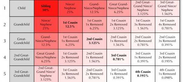
I’m sure many of you are familiar with the traditional ‘cousin calculator’ chart, such the the one below (click to enlarge):
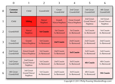 |
| Traditional Cousin Calculator Chart |
For those of you unfamiliar with how a cousin calculator works, you take two people and determine their common ancestor. You move in one direction (i.e. along the top) from the common ancestor until you reach the relationship of the first person to the common ancestor. You then move in the other direction (i.e. down along the side) until you reach the relationship of the second person to the common ancestor. The box where those two lines merge is the relationship between the two people. For example, if you are the great-grandchild and someone else is the grandchild of a common ancestor, you move along the top to the third column for great-grandchild, and down to the second row for the grandchild, and the box that is in the 3rd column and the second row is 1st Cousin, Once Removed.
If you take a close look, you’ll notice I’ve color-coded the chart how I think we normally perceive relationships. Essentially, our sibling and parents are one degree away, our nieces/nephews and 1st cousins are two degrees away, and so forth. A second cousin is generally perceived as one degree further away from us than a first cousin. A first cousin, once removed is, at least to me, in the same category as a second cousin, and that’s what this chart shows.
Now how can we actually determine how closely we’re related? One simple method is by how much DNA we share. If we add in the percentage of DNA present between any two relatives to the chart it looks a bit different (click to enlarge):
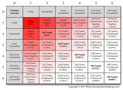 |
| DNA Cousin Calculator Chart |
Note in the above chart that I’ve changed the color coding to match the percentages of shared DNA. The colors no long take a box shape around the common ancestor, but instead move out in the straight line. What we can see by looking at the numbers is that actually the degree of relationship is moving twice as fast as we perceived before. From a first cousin to a second cousin, the amount of shared DNA is one quarter, not one half. We perceive the second cousin as being twice as distant a relative as a first cousin, but from the perspective of DNA, they are actually four times as distant!
I know one of my 5th cousins, and we share just 0.049% DNA. That’s a half of a tenth of a percent. Not very much. Anyways, this was just an attempt to create some kind of objective view of family relationships. Of course, nothing having to do with family is really objective, right?
